Around Day 22 of my 100 Day Pattern Challenge, I found myself wondering whether a pattern could tell a story.
Not a story in the abstract sense. An actual story with characters, conflict, tension, setbacks and a resolution.
Why a Romantic Comedy?
As I mulled over the idea, I realised I needed a framework. This was my first attempt at using pattern as a storytelling medium, so I wanted something structured enough to guide the experiment without becoming overwhelming. A Romantic Comedy, or romcom to it’s friends, seemed like a good place to start. Unlike something sprawling such as the Hero’s Journey, a romcom follows a relatively clear sequence of beats and, importantly, I could fit those beats into a seven-day side quest within my 100 Day Challenge.
The framework came from Anatomy of a Romantic Comedy — Seven Essential Story Beats by Lynsay McCaulley on Well-Storied.
Looking back, it probably isn’t surprising that this was the direction I chose. Before finding surface pattern design, I spent many years writing and working in theatre. Those projects never found a particularly large audience, but that’s not really the point. The habits of storytelling stayed with me. I’ve always been fascinated by how stories are structured, how characters develop and how seemingly small moments build towards something larger.
The question I wanted to explore was whether those same ideas could be expressed visually through pattern.
Two Protagonists and Seven Beats
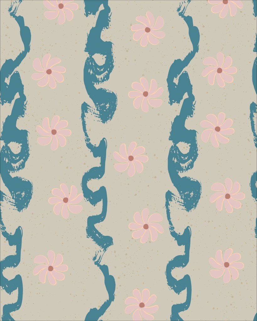
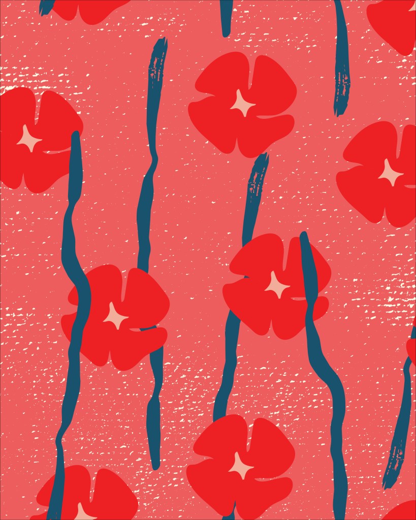
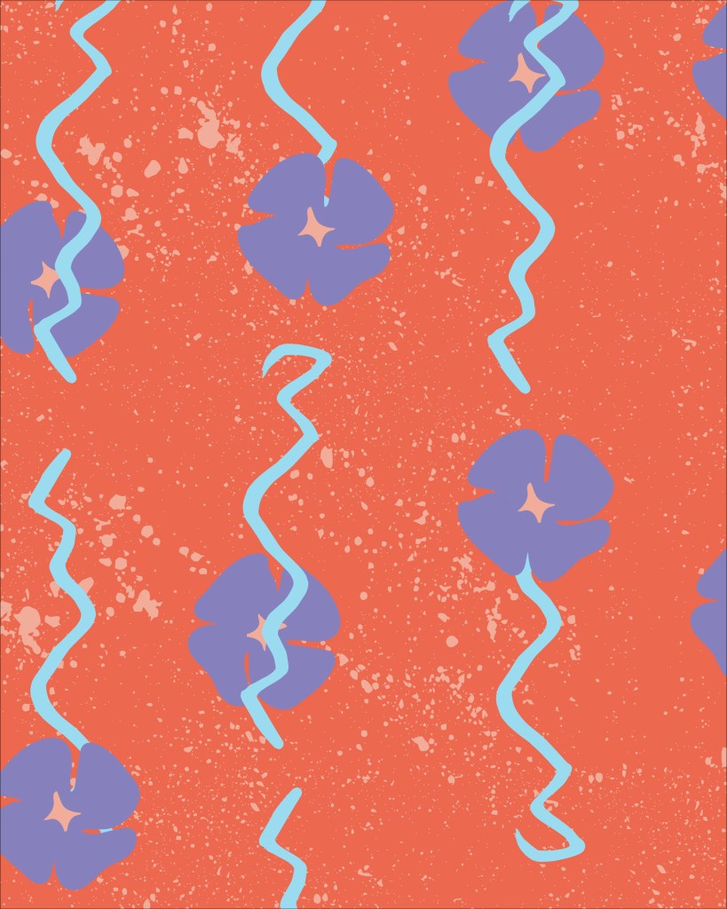
To find out, I created two protagonists: a flower and a line.
Over seven days, they would move through the familiar beats of a romantic comedy. They would meet, clash, grow closer, experience conflict, separate and, hopefully, find their way back to one another.
At least that was the plan.
What I didn’t anticipate was how quickly the protagonists would begin evolving.
The flower changed. The line changed. Their interactions became more complex as the week progressed. Some motifs became important while others quietly disappeared. At one point a small heart-shaped flower appeared with ambitions of becoming an antagonist before being written out of the story the following day. It turns out that managing a love triangle in seven patterns is surprisingly complicated.
Apparently editing applies to pattern design as well as writing.
Telling a Story Through Pattern
As the week progressed, I found myself making decisions less as a designer arranging motifs and more as a storyteller thinking about character and narrative. The patterns became less about decoration and more about behaviour.
How close should the protagonists be?
Who was pursuing whom?
Were they moving together or apart?
How could I create tension without using words?
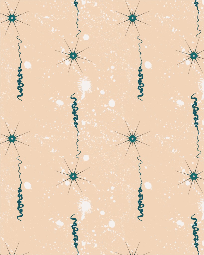
Colour became an important part of that process too. The first pattern is relatively restrained because it represents the protagonists before they’ve met. The second is slightly brighter, but also a little spikier, reflecting the awkwardness and conflict of the “meet cute” stage where the characters don’t necessarily get along.
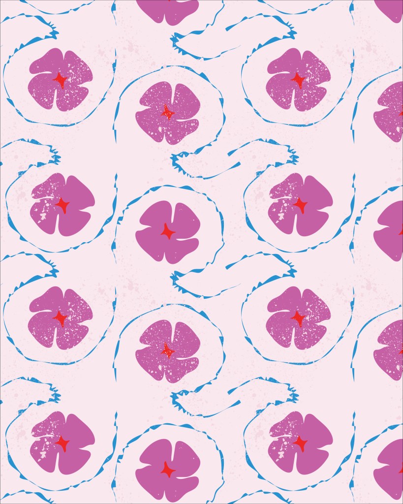
As the relationship develops, the colours become richer and more optimistic. The emotional tone of the story gradually shifts and the palette shifts with it. Colour wasn’t simply decorative; it became another storytelling tool.
The Dark Moment
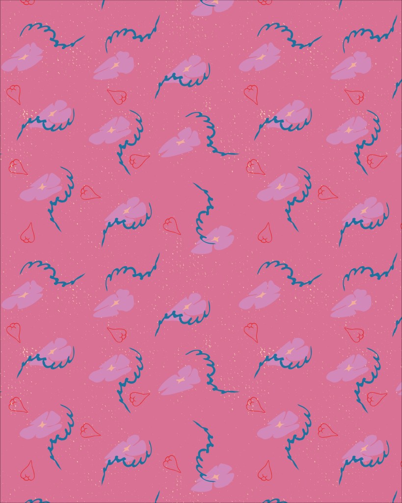
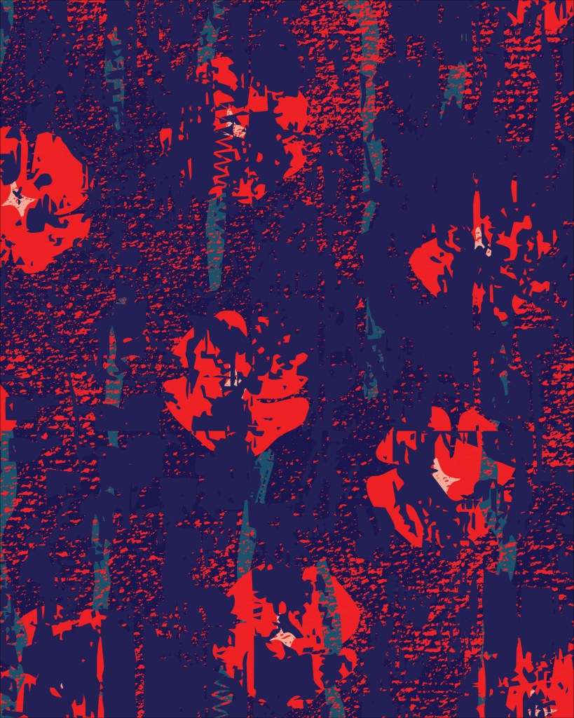
Then came pattern from day 27, now known as The Dark Moment.
Every romcom needs a crisis: the misunderstanding, the breakup, the moment where everything appears to have fallen apart. The colours darkened dramatically, the visual tension increased and the relationship that had been developing throughout the previous patterns suddenly felt uncertain.
Looking back, it’s still one of my favourite pieces from the series because it feels emotionally different from everything around it.
Creating it was also one of the most stressful moments of the challenge.
To represent the confusion and separation between the protagonists, I began layering texture over the top of the pattern. The flower and line were still there underneath, but I wanted them to feel obscured, as though they could no longer see each other clearly. It was a fairly blunt storytelling device, but it communicated the idea.
I had recently become much more confident using texture in Illustrator and unfortunately I got a little carried away.
The base pattern was already reasonably complex. Then I added another layer of texture. Then another. And another.
Before long the file had grown to around 250MB and Illustrator was becoming increasingly unhappy about the situation. Saving took an alarming amount of time and I became convinced I was about to lose the file entirely.
This was not a theoretical concern.
I sat there watching the progress bar and wondering whether I was about to lose several hours of work because I’d become overenthusiastic about texture.
Fortunately the file eventually saved and I was able to go back through the artwork and remove a large number of unnecessary anchor points.
Crisis averted.
The texture remains one of my favourite aspects of the piece, but it was a useful reminder that enthusiasm and file management are not always natural companions.
At the time it felt deeply stressful.
Now it’s mostly funny.
“Oh, I See It Now”
One of the most interesting discoveries came when I started sharing the patterns with other people.
Most viewers didn’t immediately identify specific story beats. Nobody looked at a pattern and announced that they had found the romcom breakup scene.
What they did notice was that something was happening.
People could see shifts in mood. They could tell that relationships between the motifs were changing. They recognised that some patterns felt optimistic while others felt tense, uncertain or unresolved.
Then, once I explained the storytelling framework, the pieces tended to fall into place.
“Oh, I see it now.”
That reaction was exactly what I had hoped for.
I wasn’t trying to create literal illustrations of a romantic comedy. I wanted the patterns to carry enough emotional information that the story became visible once viewers knew where to look.
The experiment suggested that patterns can do that surprisingly well.
What the Experiment Revealed
By the end of the week, I realised I had answered a different question from the one I’d originally set out to explore.
I started the project wanting to know whether patterns could tell stories.
I finished it realising that I already approach pattern design as a form of storytelling.
Looking back across the first thirty days of this challenge, that idea appears again and again. I’m interested in the relationships between elements. I’m interested in creating worlds rather than individual motifs. I like patterns that suggest there is something happening beyond the edge of the repeat.
The romcom challenge didn’t create that tendency.
It simply made it visible.
The experiment also left me with unfinished business. While the seven patterns successfully explored the story structure, I can see opportunities to develop the motifs further, refine the colour palettes and expand the visual language of the collection. Rather than feeling finished, the project feels like the first draft of something larger.
I’ll be revisiting these patterns in the future and developing them into a more considered collection.
For now, though, I’m pleased that a question that began with “Can a pattern tell a Romantic Comedy?” led to an answer that was much more interesting.
Yes.
But more importantly, it revealed that storytelling has been sitting at the centre of my creative practice all along.

Leave a comment